LumaNova
Cinematic red, real science, and a homepage that finally tells one clear story to clinics, athletes, and biohackers all at once.
The brief
LumaNova sells clinical-grade red light therapy beds and devices. The tech is real. The price tag is professional. The homepage didn't match.
Their existing Shopify site looked stitched together, with too much body copy and not enough visual hierarchy. The bigger problem: LumaNova sells to three very different buyers (chiropractors and wellness clinics, elite athletes and performance teams, and at-home biohackers) and the site couldn't speak to any of them clearly without watering down the others.
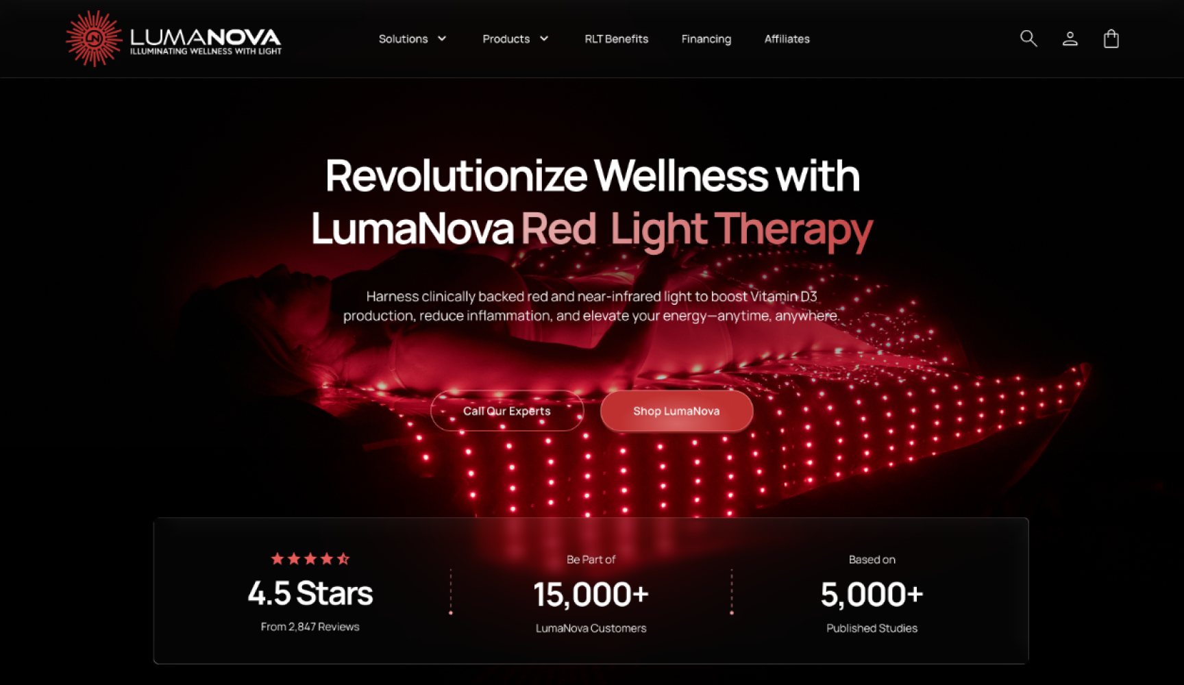
The brief was to redesign the homepage so it reads premium, communicates the science honestly, and lets each of those buyers see themselves in the first ten seconds. No spa-clean stock photography. No vague wellness platitudes.
The recipe
I broke the redesign into four moves. The big swing was the visual direction (dark cinematic instead of bright wellness). The quiet wins were structural: one component system in Figma, three-buyer scaffolding baked into the homepage flow, and trust signals pushed up to the first scroll.
-
01
Mapped three audiences, one story
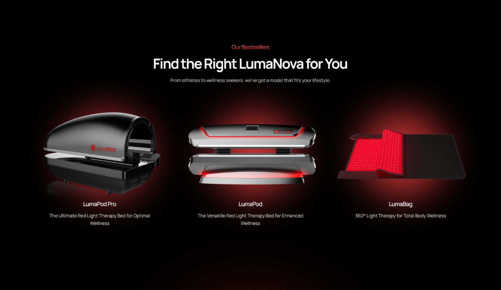
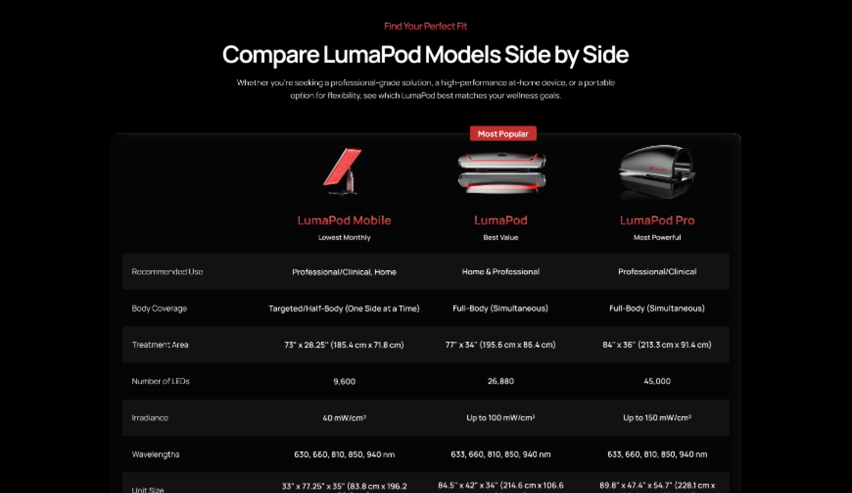
Clinics need ROI proof. Athletes need recovery numbers. Biohackers need irradiance data. Same product line, different proof points. I designed the "Why LumaNova" section as three audience callouts so each buyer sees their own headline without scrolling past the others.
-
02
Picked a cinematic direction
Dark backgrounds, crimson glow, gradient headlines that fade from white into LumaNova red. Premium tech-wellness, not med-spa. The science feels serious without looking sterile.
-
03
Built a real component system
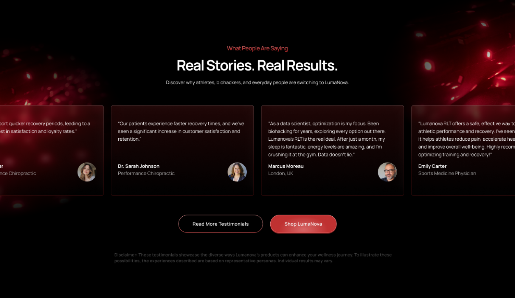
Buttons (3D + outline variants), testimonial cards, audience callouts, CTA blocks, footer. All as Figma components with tidy props so the rest of the site (PDPs, collections, landing pages) could grow from the same source without me redrawing the wheel every time.
-
04
Trust signals in the first scroll
4.5 stars from 2,847 reviews, 15,000+ customers, 5,000+ published studies — surfaced as a clean three-column band right under the hero. Most homepage redesigns bury social proof. I led with it.
"Light Up Your Path to Wellness."
— closing CTA, the brand voice we landed on
plated
What changed: the homepage now reads as one brand instead of three competing ones. Trust signals hit immediately. Each buyer sees themselves in the first scroll. The visual direction (dark + crimson glow) finally matches the price point of the actual hardware.
The component system is the bit that keeps paying off. Every new landing page or PDP since has been built from the same Figma library, which means consistent buttons, consistent testimonial cards, consistent CTAs without anyone redrawing them.
- 3 → 1 audience tiers unified
- 12+ reusable components
- v3.0 brand iteration
Tools used
- Figma
- Shopify
- Liquid
- Photoshop
- Notion